404 of the Best 404 Pages (only kidding, it’s just 9)
Some of the best 404 page examples
404 error pages are so often seen as a negative or not really considered properly when it comes to website design. Most companies would prefer you never saw the page, as naturally, they'd rather imply they have the perfect user experience.
But if you’re willing to embrace the fact that errors do happen, you can use the page as a fun way to let your brand’s personality shine through, converting a 'lost' visitor back into an engaged one.
These 404 pages are also an ideal opportunity to nest surprises for the visitor, by hiding some interesting elements for them. In this way, you transform something that can be perceived as a negative into a moment of delight.
You could think of them as being like the bloopers reel at the end of a superhero film. The film stands alone fine without them, but they’re a little Easter egg for your viewers who stick around for the credits - or web visitors in this case who are rewarded for finding the ‘lost’ page.
We’ve picked our best 404 examples, that show the two main routes brands take with error pages, beyond the typical ‘Oops! Page Not Found’ message - pages that encourage the user to interact with them, and those that simply display
brand personality well or use humour to resonate. But some examples naturally cross both of these categories.
Warning, one of them may be a bit NSFW ;-)
404 Pages with Brand Personality
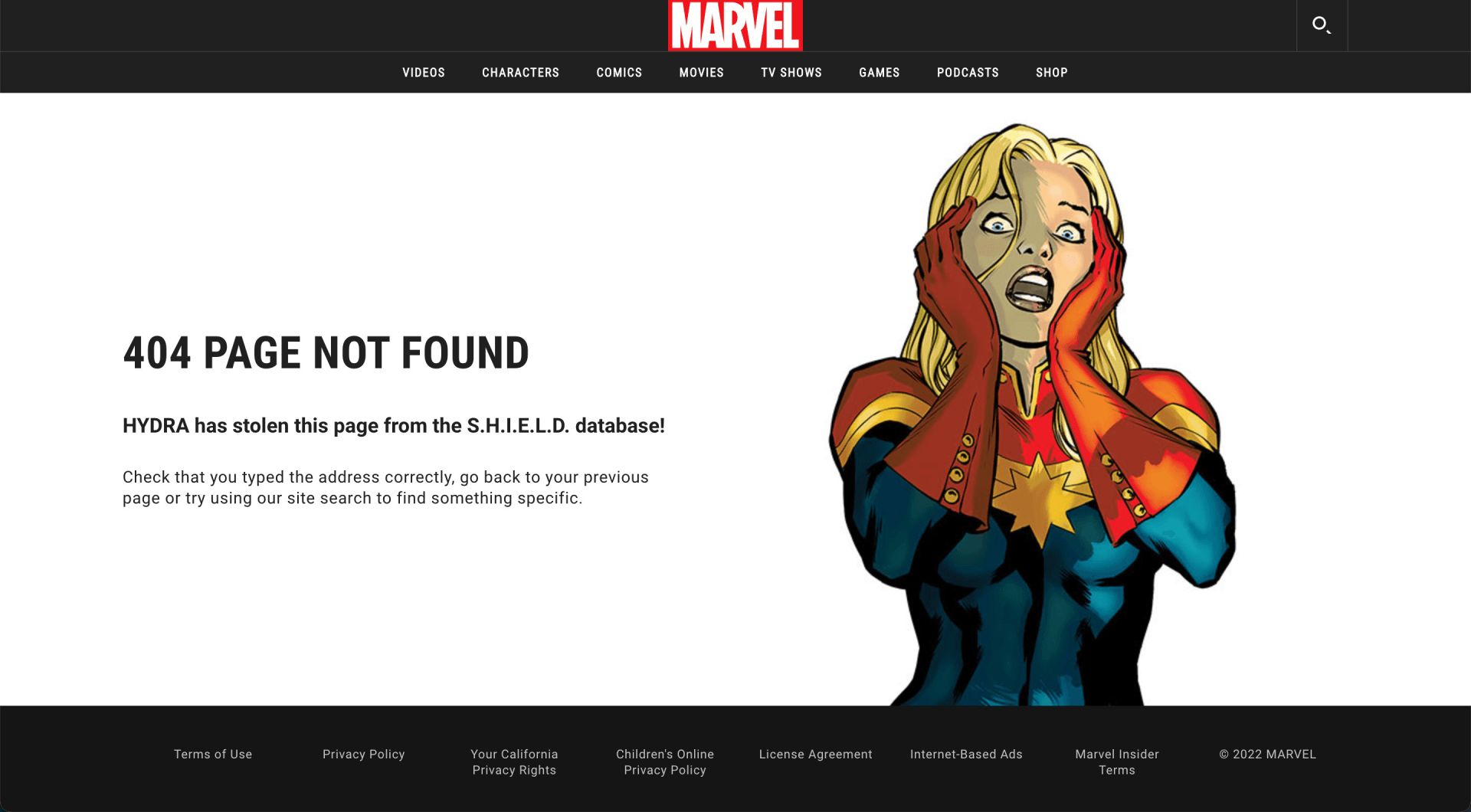
Marvel: HYDRA is currently attacking this page! (plus other on-brand variations)
Neil: Marvel’s 404 page takes advantage of the full resources of its own artwork library, loading a randomised comic book image each time, many of them animated. In addition, each illustration has its own strapline as an explanation of why the page doesn’t exist; all in-keeping with the story of the character shown.
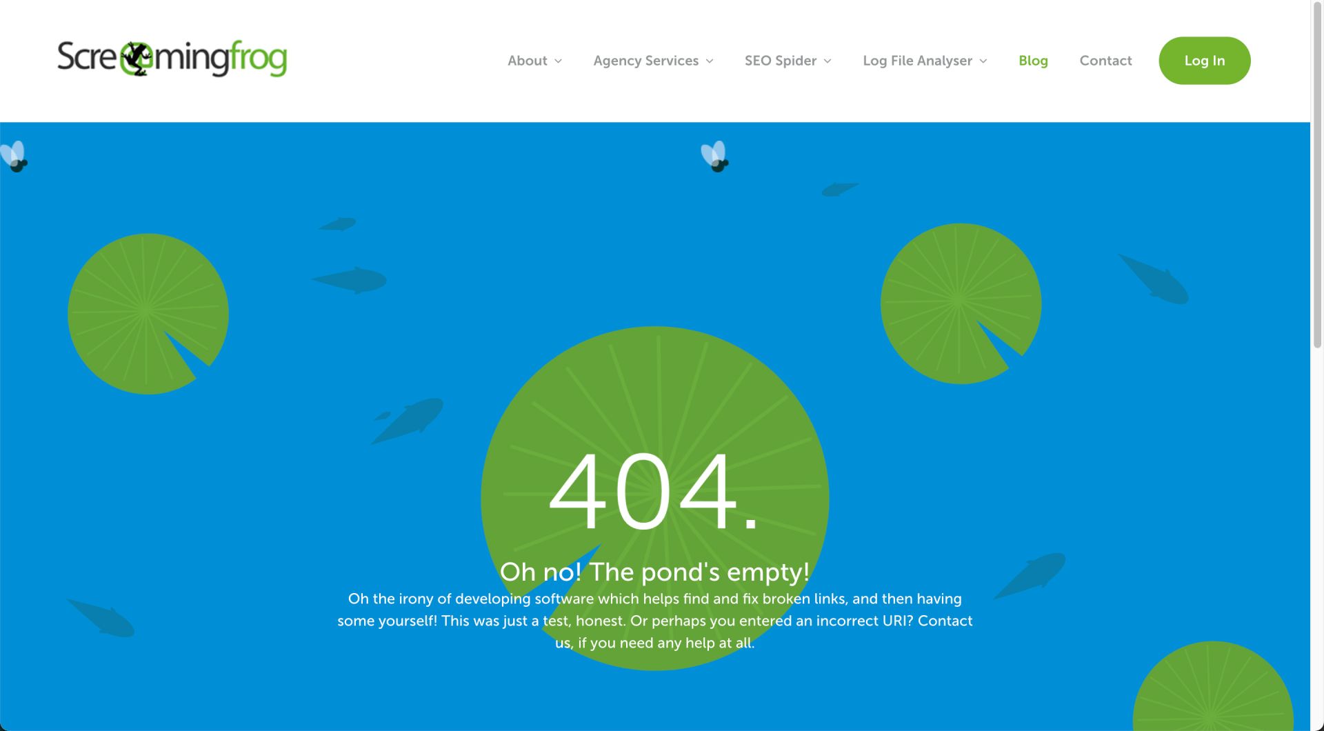
ScreamingFrog: Oh no! The pond's empty!
Ian:
ScreamingFrog is a perfect example of using simple animation to add a little brand analogy. Animation is great because it enables a brand to keep in line with the concept of the site, while taking a bit more freedom to play. In this example, in a nod to the brand name, the user is shown an animated empty pond - basically, they’ll find no frogs there.
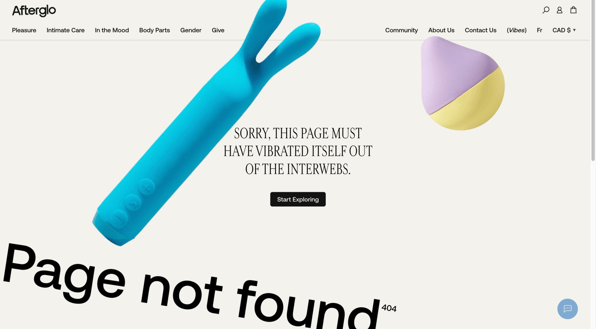
Afterglo: SORRY, THIS PAGE MUST HAVE VIBRATED ITSELF OUT OF THE INTERWEBS.
Wardy:
Afterglo, a vibrating pleasure toys brand, has a great example of how animations within web development can actually help to translate elements of the product in a playful way. In this case, it’s vibrating sex toys, along with a hint of the brand’s personality and tone of voice. Even the logo is vibrating on this page.
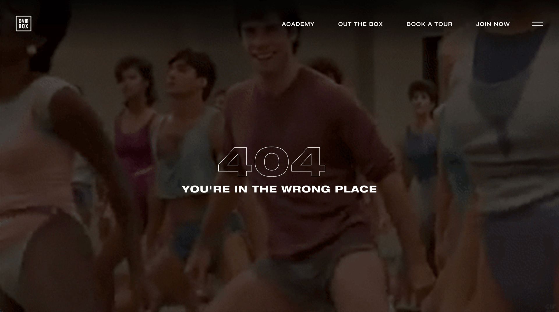
Gymbox: YOU'RE IN THE WRONG PLACE
Neil:
Gym and fitness brand,
Gymbox, uses pure entertainment and comedy on their 404 page, using a looped video of John Travolta in a fitness class to reinforce the message that you’re in the wrong place. Great way to bring the brand’s personality through.
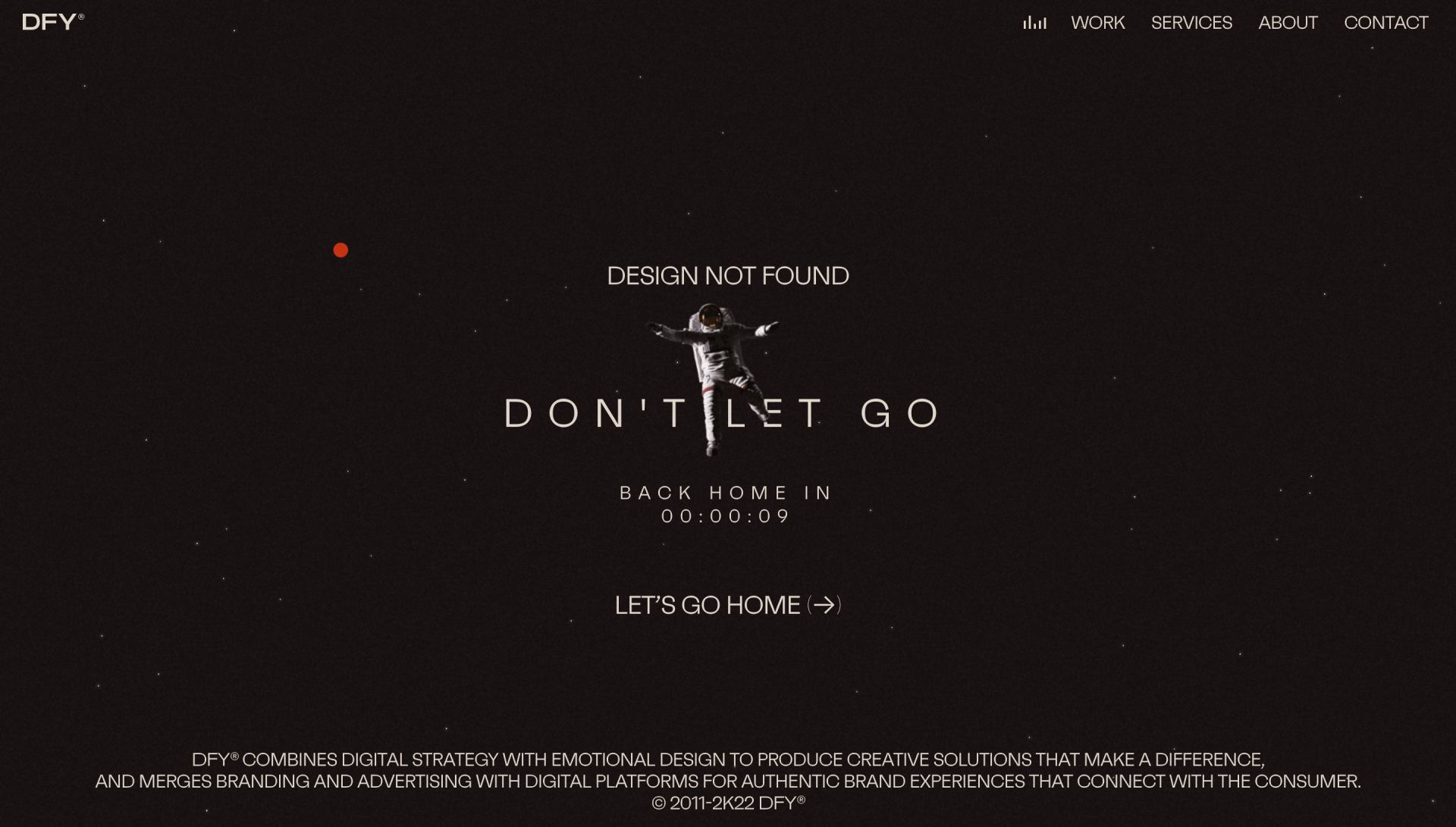
DFY: Don’t let go
Wardy:
South
Korean design agency
DFY has a playful 404 which exaggerates the feeling of being lost. It has a film vibe to it, and demonstrates this using an astronaut disappearing into space - leaving you feeling as if you want to reach out and grab his hand! It also automatically takes the user back to the homepage after a 10-second countdown, which is a great touch.
Interactive 404 Pages
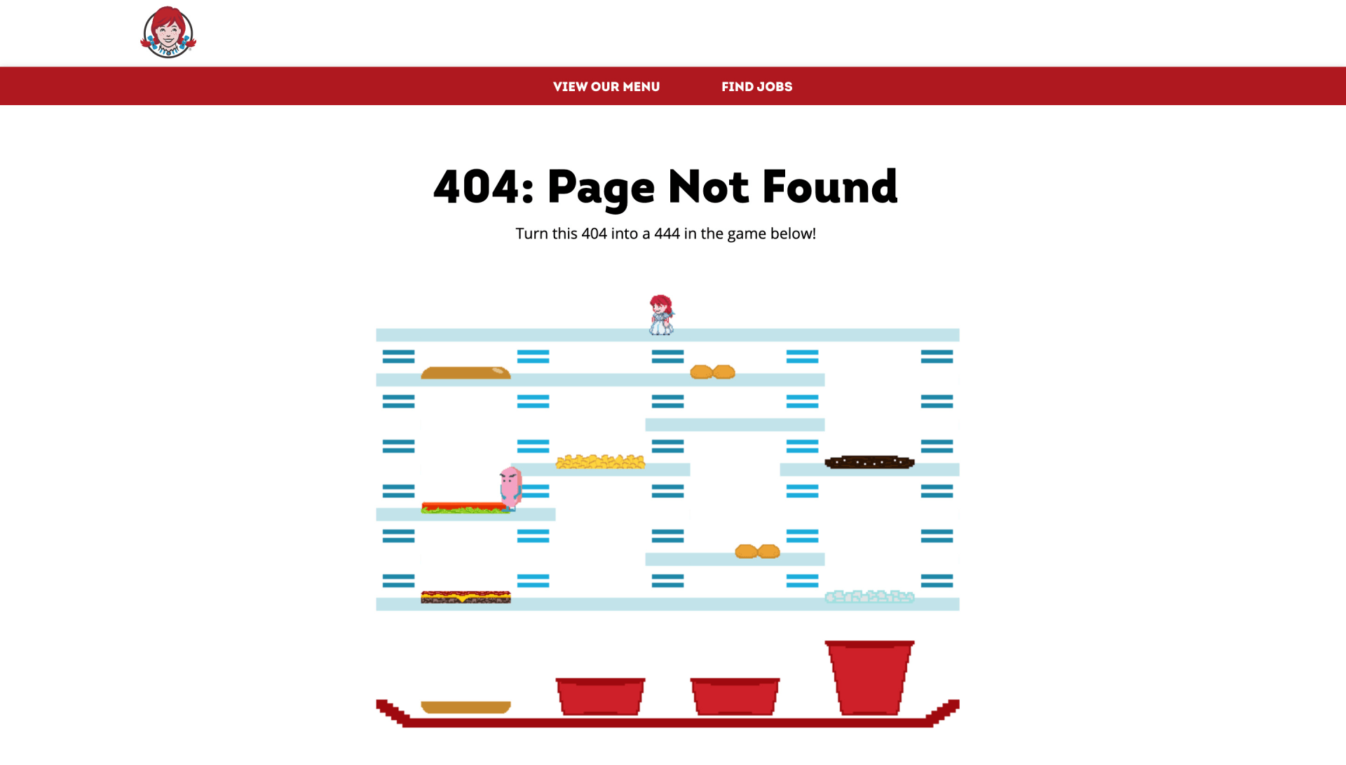
Wendy’s: Turn this 404 into a 444 in the game below!
Ian:
Wendy’s has created a mini retro arcade game for users to enjoy when they land on a page that doesn’t exist. This is a really fun way to engage users on a page that’s effectively a glorified redirect page.
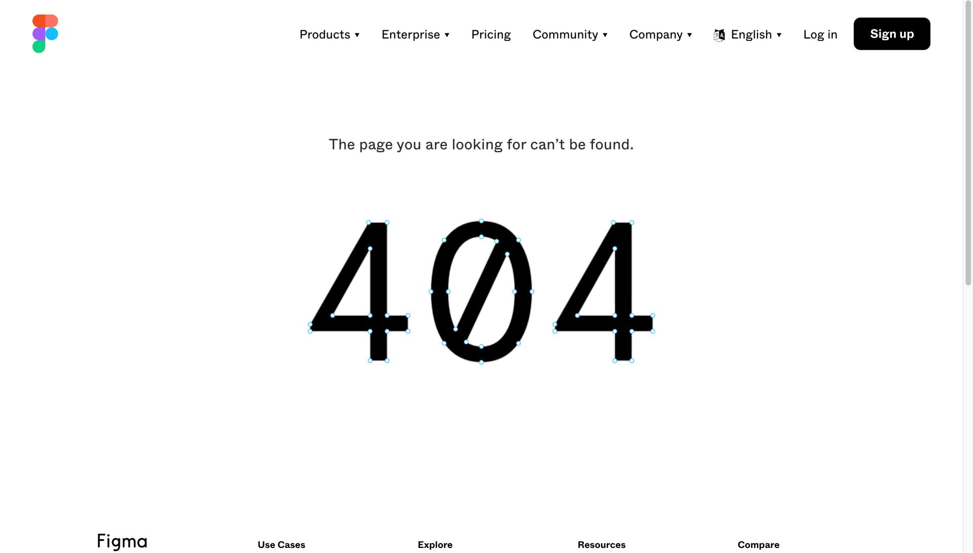
Figma: The page you are looking for can’t be found.
Neil:
Figma is an all-in-one design platform, and they’ve created a nicely interactive 404 page that plays on one of the features of their product. The '404' itself is created as a series of paths with anchor points that you can pick up and drag, changing the shape of the numbers. It adds that little extra fun to the experience of being ‘lost’ on their site while staying true to the product.
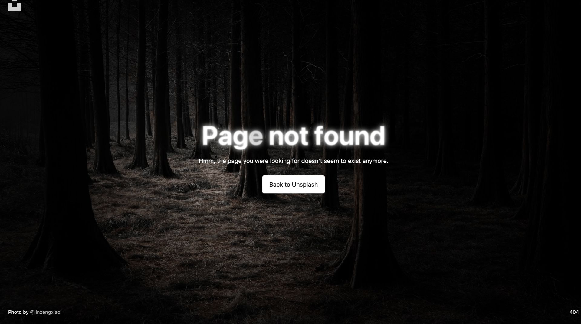
Unsplash: Hmm, the page you were looking for doesn’t seem to exist anymore.
Wardy:
Online image library,
Unsplash, uses a series of randomly generated darkened images along themes such as space or caves, to suggest that the user is lost. Moving the mouse creates a torch effect where you can explore the image. It brilliantly highlights the photography on the website, while allowing the user to play by hovering the torch over the image. A really nice touch!
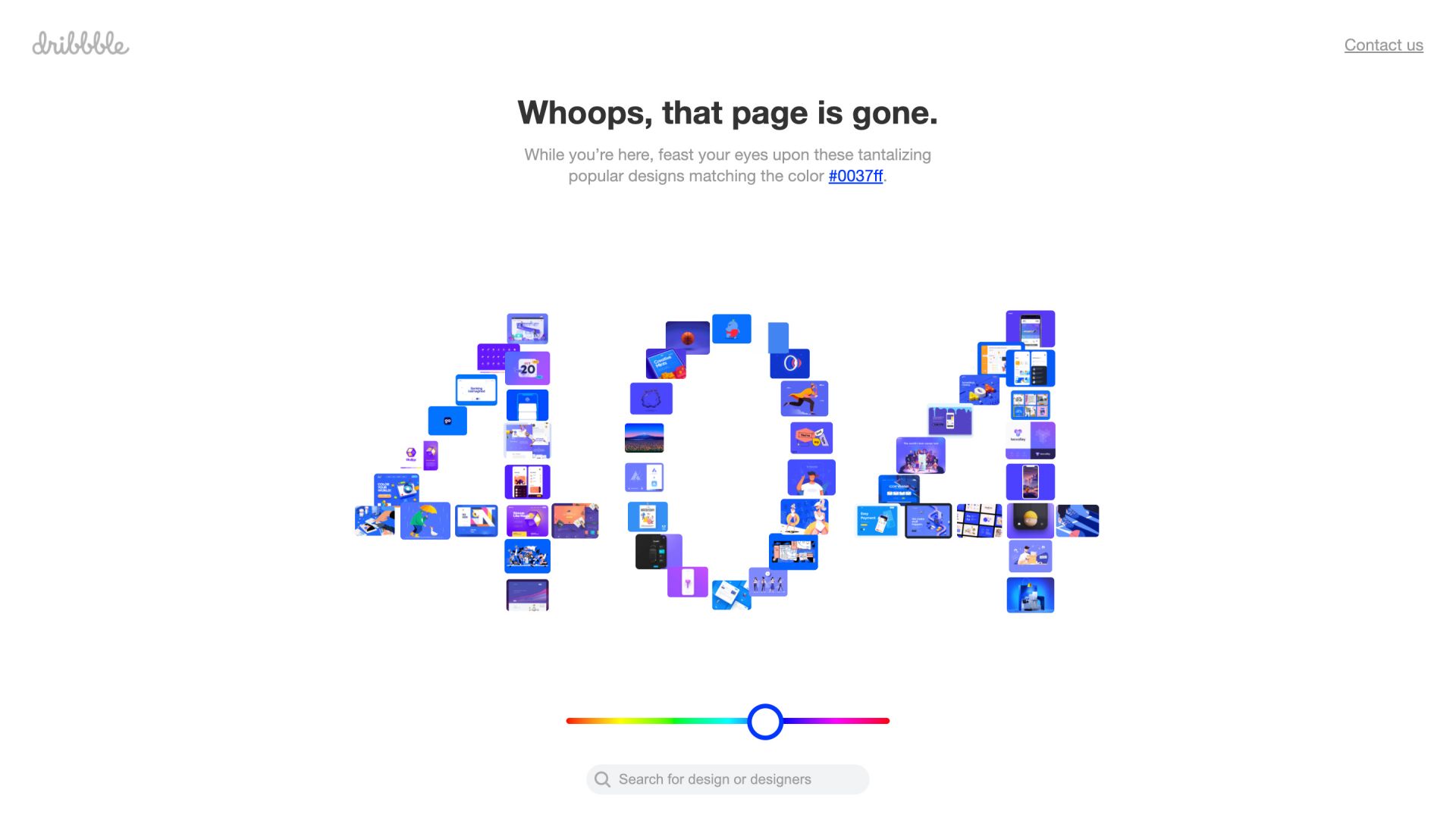
Dribbble: While you’re here, feast your eyes...
Ian:
Dribbble makes brilliant use of the 404 space to showcase a fun tool they’ve created. The user can select a colour using a slider at the bottom of the page, and a range of images are returned based on their selection, in the shape of the numbers 404. It keeps in line with the creative nature of the site, while simultaneously offering inspiration on a page whose primary focus it to control users from leaking outside of the site map.
What Does Your 404 Page Say About Your Brand?
If your website is in need of a
design refresh or a UX redesign, we’d love to help. We’ll even design you an awesome 404 page. Just give us a call on 01603 555 916, or
click here to book a consultation.
Talk to the team...
Ready to transform your brand's presence and accelerate your eCommerce impact?
No commitment, simply free expert advice with one of our ecommerce or brand directors.
Your future success story could begin today

